Accessibility Support in Enact
We recognize that applications built using our framework should be usable by anyone regardless of ability. As a result, accessibility has been a key concern for Enact since inception.
Roles
We address native semantic meaning and accessibility by assigning ARIA roles to custom components. When possible, we’ve assigned the relevant role to each of our custom components which can be overridden by users if needed.
import CheckboxItem from '@enact/sandstone/CheckboxItem';

const App = (props) => {
	return (
		<div {...props}>
			{/* Renders a CheckboxItem with the default role, checkbox */}
			<CheckboxItem>Sign me up for Enact news!</CheckboxItem>
			{/* Renders a CheckboxItem with the custom role, menuitemcheckbox */}
			<CheckboxItem role="menuitemcheckbox">Sign me up for Enact news!</CheckboxItem>
		</div>
	);
};
Attributes
There are also a set of ARIA attributes that reflect the current state of a component such as aria-checked for a checkbox or aria-valuetext for a slider. In these cases, Enact will map the public prop (e.g. selected or value) to the appropriate ARIA attribute.
In
@enact/sandstone, some components include additional ARIA configurations specific to webOS. Those may be (or may soon be) overridden by consumers to suit their own requirements.
Custom Components
We’ve included a few custom components that may be useful to build accessible applications. These are not required but they can provide some syntactic sugar for ease of development.
sandstone/Region
sandstone/Region provides a labeled region to group components. The title is wrapped by a sandstone/Heading to provide visual context to the children. The Heading and children are wrapped by a <div role="region"> with its aria-label set to the title to provide aural context.
import CheckboxItem from '@enact/sandstone/CheckboxItem';
import Region from '@enact/sandstone/Region';
import Group from '@enact/ui/Group';

const App = () => {
	const items = ['item 1', 'item 2'];

	return (
		<Region title="Select an Option">
			<Group childComponent={CheckboxItem} selectedProp="selected">
				{items}
			</Group>
		</Region>
	);
};
ui/AnnounceDecorator
ui/AnnounceDecorator includes a Hook that provides a method to notify the user of a state change. The method can be called with a string that is inserted into a node with the alert role.
import Button from '@enact/sandstone/Button';
import {useAnnounce} from '@enact/ui/AnnounceDecorator';
import {useCallback} from 'react';

const ExampleComponent = () => {
	const {announce, children} = useAnnounce();

	const notify = useCallback(() => {
		announce('This text will be alerted to user by TTS');
	}, [announce]);

	return (
		<div>
			<Button onClick={notify}>
				{children}
				Notify on Click
			</Button>
		</div>
	);
};

const App = () => {
	return (
		/* when clicked, the user will be alerted with 'this text will be alerted to user by TTS' */
		<ExampleComponent />
	);
};
Debug Accessibility
Enact also provides ways to debug these accessibility implementations.
In Sampler
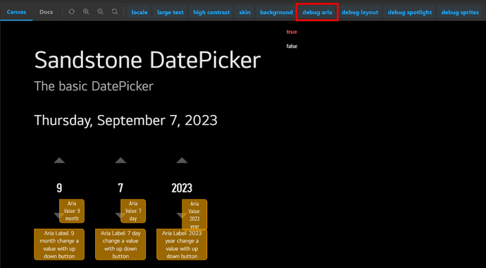
We provide a sampler in UI COMPONENTS that implements several UI components as Storybook.
If click the debug aria tab located at the top of the page of the sampler and select true, the ARIA properties of each component is displayed as shown in the image below.
In Enact App
This debug feature is designed to work if a class debug aria is given to any enact app.
So just add debug aria to className prop in your enact app to see the applied ARIA properties.
The following example demonstrates the usage of debug aira className.
import ThemeDecorator from '@enact/sandstone/ThemeDecorator';

const AppBase = (props) => {
	return (
		<div {...props}>
			...
		</div>
	);
};
const debugAppBase = () => {
	return (
		<AppBase className='debug aria' />
	);
};
const App = ThemeDecorator(AppBase);